Introduction
This is a post about several bitmap fonts I modify from M+, Tewi, Lemon, & Siji. At first I modify them because I can’t find any bitmap font that suitable for my personal preferences.
- I want a small bitmap font that can fit in 6x10 bounding box, but placed inside 6x12 bounding box for extra line spacing. I want extra line spacing for readability reason. I know I can add line spacing in URxvt configuration. But I want to use it not only in URxvt.
- Has less curve, to make it looks less pixelated and comfortable for my eyes. But when I find a font that has less curve, it usually too boxy.
- Double storey “a”.
- Slashed zero, I don’t want dotted zero.
- Lowercase “l” at least filling four pixels width.
- Lowercase “i” at least filling three pixels width.
- Reduced pixel to make it less cluttered.
- Two pixel descent part, too make it well aligned with iconic font in statusbar.
- Seven pixel average uppercase & numeric height.
- Five pixel average lowercase height.
- Five pixel average character width.
- Comfortable to read.
- Has same height of cross in “t” and “f”.
- Dot in lowercase “i” and “j” only separated by one empty pixel from the line.
- And other character selections preference.
Every bitmap font I tried can’t fully satisfy me. It must be something lack. Then I tried to install & launch FontForge. But I didn’t know what to do with it. So, I tried to open M+ bitmap font then used it as the base. I kept modifying the characters until it could satisfy me. And it was harder than I thought. I needed a lot of trials of modification & use. If when I was using it I felt something not right, I launched FontForge again and modify something. I kept repeating it until several weeks (I couldn’t fix them in one night, I have limited freetime). Then I decided to settle. It already made me happy. But my curiousity drove me to make some experiment with bitmap font. I modified it to make some variants. I have been enjoying it, time to share the delight. Also to keep the spirit of open source.
Disclaimer
These fonts are designed for my personal preferences, maybe not suitable for you. I’m not a programmer or in any IT profession, so I don’t know if these font could work for programming. I use them for writing article with markdown, shell scripting, editing plain text configuration files, editing XML (I use Openbox by the way), and many other, using Vim inside URxvt. Because I use them in URxvt, it also affects my ncmpcpp music player, ranger file manager, htop task manager, and many other terminal apps. I also use these font for panel, dunst notification, and any font needed by Openbox like titlebar text (but not visible), root menu, client menu, & on screen display. I don’t use them in GTK because they will be mixed with truetype font in some apps like Firefox, LibreOffice, GIMP & Inkscape. It causes me feel dizzy. Also I usually using light theme when using them, because dealing with white canvas in dark theme makes me going blind. Using bitmap font in light theme is blinding me even faster. I care about my healthiness.
Preview
Rissole
This font is the most frequently font I use. But I’m insterested to make some experiment with bitmap font. So I make several other variants. When I use this font, sometimes I feel that this font has too much reduced pixels. I make a variant of this font with restored pixels called Canele. Both are based on M+.
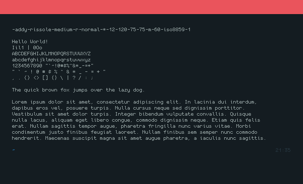
- Bounding Box 12x6
- Average Uppercase Height 7px
- Average Lowercase Height 5px
- Average Numeric Height 7px
- Average Character Width 5px
- Ascend 10px
- Descend 2px
- Encoding iso8859 Latin
- Base M+
Canele
Pretty similar with Rissole, but this font contains more pixels.

- Bounding Box 12x6
- Average Uppercase Height 7px
- Average Lowercase Height 5px
- Average Numeric Height 7px
- Average Character Width 5px
- Ascend 10px
- Descend 2px
- Encoding iso8859 Latin
- Base M+
Castella
I make the uppercase and numeric taller in this font, and add 2px extra vertical bounding box. So, the linespacing remains tall. But apparently creating a tall font is not a good idea.
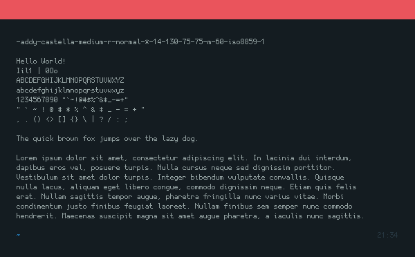
- Bounding Box 14x6
- Average Uppercase Height 8px
- Average Lowercase Height 5px
- Average Numeric Height 8px
- Average Character Width 5px
- Ascend 10px
- Descend 2px
- Encoding iso8859 Latin
- Base M+
Mochi
Then I tried to make an experiment with 4px character width font inside 5px width bounding box. This font is based on Lemon. I tried to make it looks more “formal”. I keep modifying the characters, and unintionally make it looks like Scientifica. Despite the bounding box width only 5px, I still make the bounding box height 12px, so this font looks narrow.
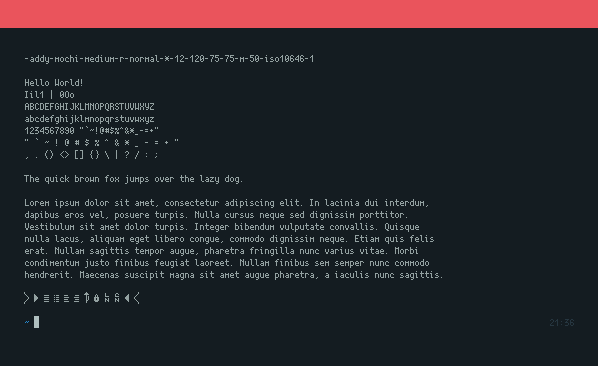
And because the encoding is iso10646, I draw some common powerline characters in area e0a0 to e0a3, e0b0 to e0b3, and e1f1 to e1f4. I only test the powerline characters with zsh agnoster. Hopefully it will works with other plugins too. I personally don’t use powerline because it’s too mainstream and no longer cool enough.
Some characters cannot be drawn normally due to its narrowness. After some while using this font, I realized that 4px width characters font is not a good idea. I never go to optical clinic in my life, not even once. And I never wear eyeglasses (except zero dioptri for fashion purpose). I don’t want to break my healthy eyes, so I abandoned this font.
- Bounding Box 12x5
- Average Uppercase Height 7px
- Average Lowercase Height 5px
- Average Numeric Height 7px
- Average Character Width 4px
- Ascend 10px
- Descend 2px
- Encoding iso10646
- Base Lemon
Tiramisu
This is just taller version of Mochi, and I just make it even worse.
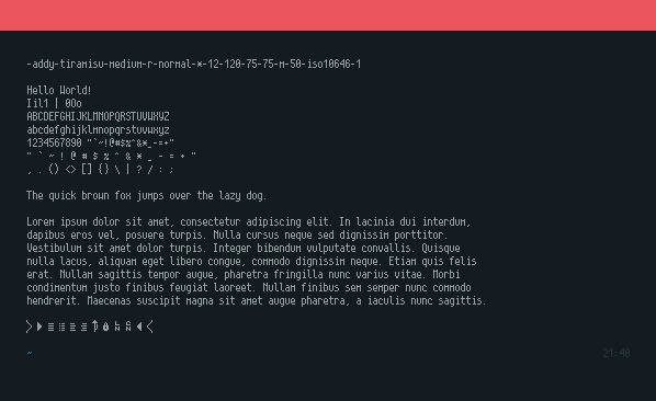
- Bounding Box 12x5
- Average Uppercase Height 8px
- Average Lowercase Height 5px
- Average Numeric Height 8px
- Average Character Width 4px
- Ascend 10px
- Descend 2px
- Encoding iso10646
- Base Lemon
Sundae
I tried to make some characters look curvy, but not too much. And finally, this font looks pixelated and cluttered which defeating my main purpose. I’m still using this font, but usually not for long use. I feel dizzy if use this font for too long. I tried to switch the base from M+ to Tewi. So, this font support unicode and powerline. If you want to use Rissole & Canele but also want powerline in URxvt, you can use this font as fallback.
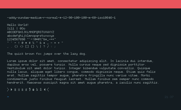
- Bounding Box 12x6
- Average Uppercase Height 7px
- Average Lowercase Height 5px
- Average Numeric Height 7px
- Average Character Width 5px
- Ascend 10px
- Descend 2px
- Encoding iso10646
- Base Tewi
Pretzel
Just the bold version of Sundae. I usually use this font as bold font in URxvt. The normal font still Rissole, Canele, or Sundae. This font also heavily based on Tewi.
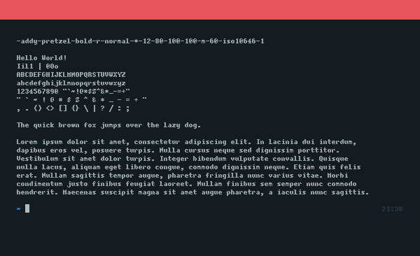
- Bounding Box 12x6
- Average Uppercase Height 7px
- Average Lowercase Height 5px
- Average Numeric Height 7px
- Average Character Width 5px
- Ascend 10px
- Descend 2px
- Encoding iso10646
- Base Tewi
Waffle
When I opened Siji font, I saw that a lot glyphes had different vertical & horizontal alignment. That explains why some of the glyphes weren’t aligned well with text in the statusbar. So, I adjusted them to make it paired well with text font with 7px Uppercase height & 2px descent, one by one. Horizontally centered too. And glyphes which have odd-number of pixels, mathematically couldn’t be centered inside 12px width bounding box. So, I dragged them all to the left. I also added 155 self-drawn glyphes.
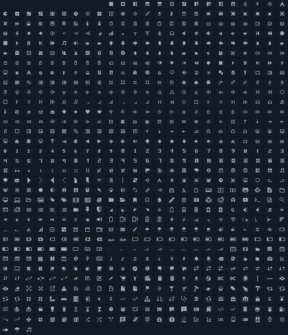
- Bounding Box 10x12
- Average Uppercase Height N/A
- Average Lowercase Height N/A
- Average Numeric Height N/A
- Average Character Width N/A
- Ascend 8px
- Descend 2px
- Encoding iso10646
- Base Siji
I usually copying iconic font using Gucharmap. Launch Gucharmap > Change font to waffle > In the “View” menu check “Show only glyph from this font” > Change the script to Common > Repeatly hit PageDown in glyph list, the glyph is started from U+E000 area. And they are copyable.
How To Use
Clone The Font
Clone the font from my GitHub repository to your font folder in home. I recommend you to put it in ~/.fonts/misc/
|
|
X Logical Font Description
- Load the font using xset
|
|
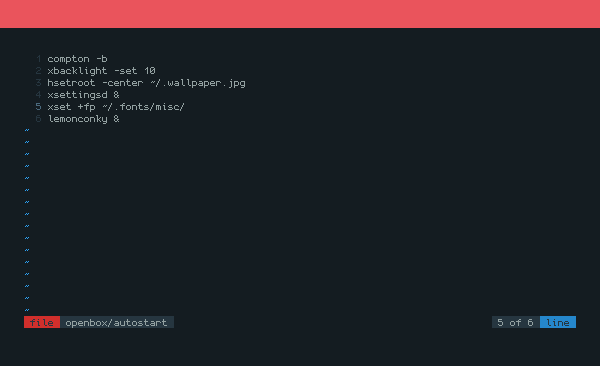
- Also add it to your autostart to make your life easier, I use Openbox so the autostart is in ~/.config/openbox/autostart file
- On application with X Logical Font Description, write the font name as..
|
|
But because I use different name for every font, we could wildcard it
|
|
- URxvt example (My full URxvt configuration is in this post)
|
|
- URxvt example with fallback and style
|
|
- Other apps those support XLFD : Lemonbar, Fluxbox Style, i3 if Pango disabled, Dzen2, Conky, Spectrbar, dmenu, etc etc
Fontconfig
Not every app support XLFD method, so we need to load these font to Fontconfig. I use Debian, and bitmap font is blocked by default by Fontconfig. Common way to unblock the bitmap font in Debian and derivative is by deleting the /etc/fonts/conf.d/70-no-bitmaps.conf file. But I prefer to reduce touching system file. So, I create a user wide Fontconfig configuration in ~/.fonts.conf file instead.
Allowing every bitmap font to be loaded by Fonconfig has side effects. So, I keep blocking them but creating whitelist for my font.
|
|
Just in case you wonder with my full Fontconfig
|
|
I didn’t delete the /etc/fonts/conf.d/70-no-bitmaps.conf, so actually I don’t need to reject the font in ~/.fonts.conf, I only need to add whitelist. I keep it because this configuration is shared with my Void Linux setup.
Dont forget to refresh the font cache
|
|
Now you can use Rissole font on app that don’t support XLFD, for example..
- Dunst (My full Dunst configuration is in this post)
|
|
- Openbox
|
|
Scaling bitmap font is not a good idea, I recommend you to only use 8 point in size
End
And as always, thanks for reading!